How to use this in creating JS component (Vue.js)
For example, we need to create a component Button, which has several states: default, disabled, loading.
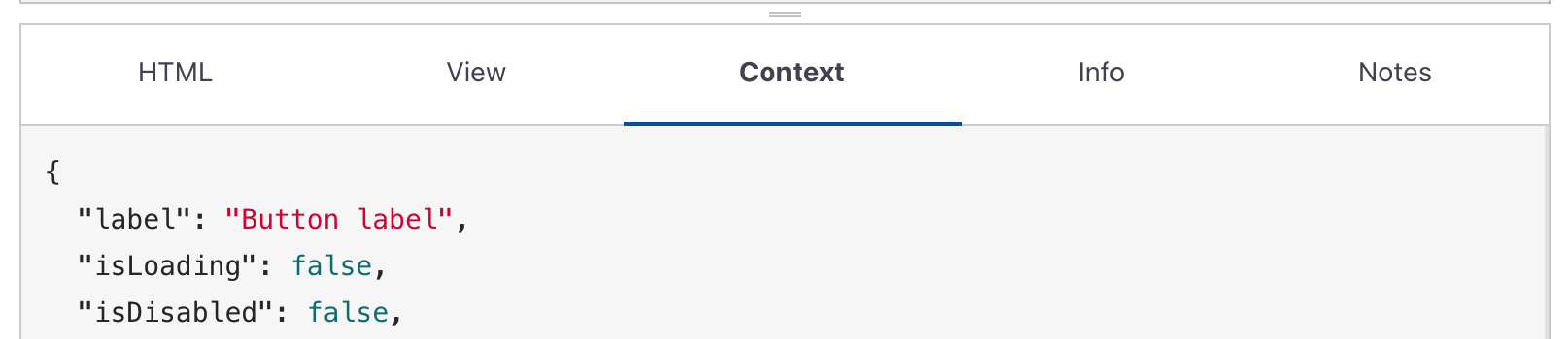
Each element has the ‘context’ tab. All attention on this section. It is a JSON object.
Let’s look at the “button-filled” -> section “classes”. This section is must important for using.
"classes": {
  "base": "inline-flex items-center no-underline transition leading-none select-none outline-none focus:outline-none relative",
  "block": "w-full justify-center",
  "size": {
    "small": "h-7 px-3 text-xs rounded-sm",
    "default": "h-10 px-4 text-base rounded",
    "large": "h-12 px-5 text-xl rounded-md"
  },
  "theme": {
    "common": "text-white",
    "default": "focus:ring-2 ring-blue-400 ring-opacity-50 bg-blue-400 hover:bg-blue-500 active:bg-blue-600 active:translate-y-0.5",
    "disabled": "cursor-not-allowed bg-blue-300",
    "loading": "text-opacity-0 bg-blue-400 cursor-not-allowed after:border-r-transparent after:border-white after:animate-spin after:rounded-full after:w-4 after:h-4 after:left-1/2 after:top-1/2 after:block after:absolute after:border-2  after:-ml-2 after:-mt-2"
  }
}
Main classes names
- ‘classes.base’ - this classes names is constant for each of state button.
- ‘classes.size’ - here you can check needed classes names for set size button. if we use button as block(full width) need add to use ‘classes.block’
Section ‘theme’
this section includes class names for visual view - (color theme to be precise)
- ‘theme.common’ - common for each states for swhitch state of button we need change group of classes names
- ‘classes.theme.default’ - default state of button
- ‘classes.theme.loading’ - loading state
- ‘classes.theme.disabled’ - disable state
In result we can use it like this
<template>
<button :class="classButton">
  Title button
</button>
</template>
<script>
export default {
  data(){
    return{
      stateButton: 'disabled', // dynamic - can be disabled, loading, default(null)
      buttonClasses: {
        // classes.base + classes.size + theme.common
        base: "inline-flex items-center no-underline transition leading-none select-none outline-none focus:outline-none relative h-10 px-4 text-base rounded text-white",
        // classes.theme.default
        default: "focus:ring-2 ring-blue-400 ring-opacity-50 bg-blue-400 hover:bg-blue-500 active:bg-blue-600 active:translate-y-0.5"
        // classes.theme.loading
        loading: "text-opacity-0 bg-blue-400 cursor-not-allowed after:border-r-transparent after:border-white after:animate-spin after:rounded-full after:w-4 after:h-4 after:left-1/2 after:top-1/2 after:block after:absolute after:border-2  after:-ml-2 after:-mt-2"
        // classes.theme.disabled
        disabled: "cursor-not-allowed bg-blue-300"
      }
    }
  },
  computed: {
    classButton(){
      let resultClass = this.buttonClasses.base
      if( this.stateButton ==='disabled') {
        resultClass += this.buttonClasses.disabled
      } else if(this.stateButton ==='loading'){
        resultClass += this.buttonClasses.loading
      } else {
        resultClass += this.buttonClasses.default
      }
    }
  }

}
</script>